Creating Coral House
Coral House, named for the iconic Santa Monica tree that stands at its entrance, is located on a coveted street in Los Angeles, overlooking the canyon, with views to the beach and the blue and white surf of the Pacific.
This project reflects a collaboration between Whipple Russell Architects and Livia Tomiselli of LTA+D, who created the interior, landscape, and lighting designs. She and her team also procured the palette of materials – mainly stone, steel, wood, mosaics and porcelain tiles – from Italy, and custom designed all the cabinets, doors, handles, rugs, and handrails.
Livia had worked for this client previously, so she knew he was a collector of model ships, matchbox cars, actual vintage cars, vinyl records, and many objects d'art. Also, he enjoyed a bit of the whimsical. Curating and displaying these objects provided an unusual challenge within the project. She and the client also wanted to incorporate some of the special items that were salvaged from the 1940s house that was originally on the site. They wanted to preserve and show appreciation for these singularly beautiful, artistic elements from the past.
Entryway and Exterior
The entry courtyard features ponds and a stepping pad walkway, one of Marc’s signature elements, creating a clear and calm transition from the street to the house. These ponds use filtered, recycled rainwater water collected in a cistern under the driveway.
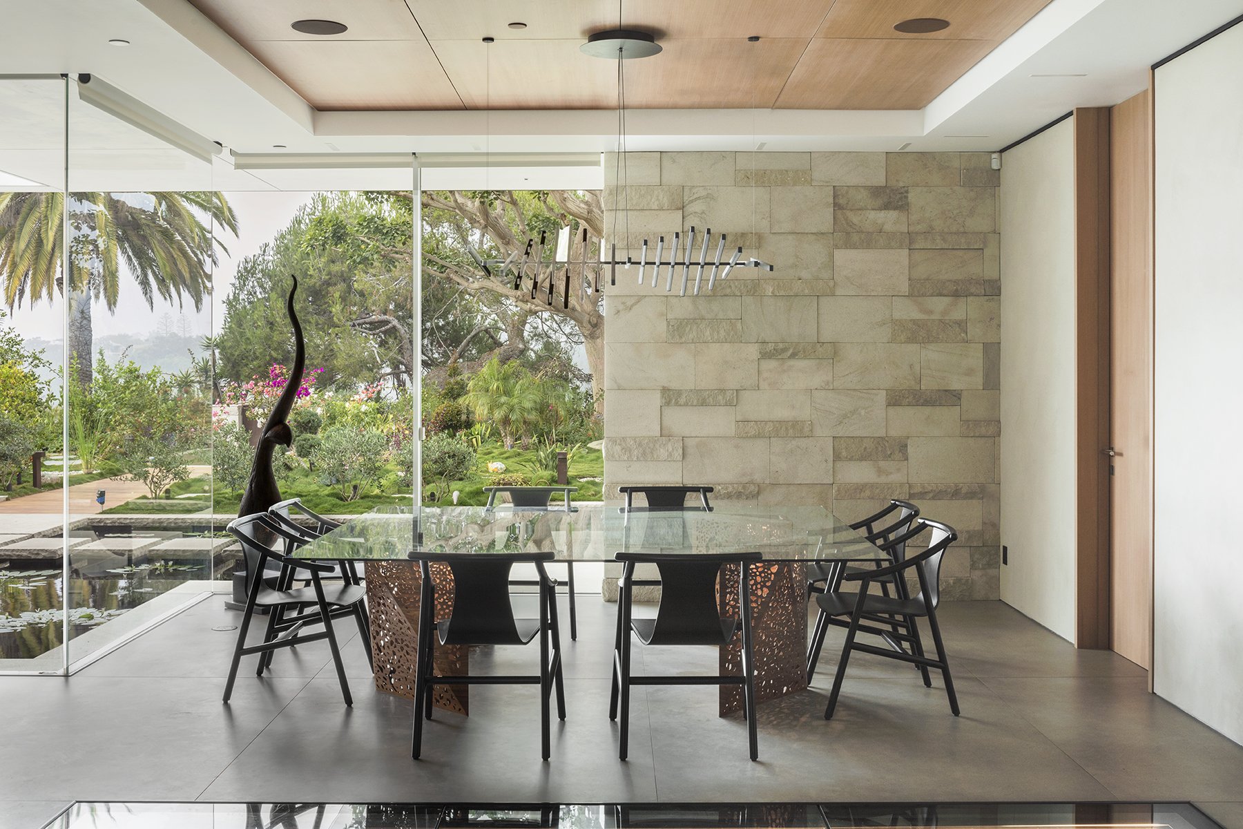
Livia likes to repeat the use of simple materials and chose “Grigio Perla” stone (extracted in the Tuscan Maremma) as the main material inside and out. “Grigio Perla” stone is characterized by a significant surface porosity, and is a very strong sandstone with a rather uniform light gray color tone, which gives it a very delicate appearance. It is a sedimentary lithotype with yellowish veins and reddish patches that blends very well with other natural materials like wood or steel. “The stone pattern that you see in the facade is the same as in the interior. We designed the pattern and had the pieces fabricated, numbered, shipped here and then assembled.”
To compliment the stonework, the upper level façade is accented with custom-assembled extra wide teak planking that is brought inside as well.
An antique feature from the old house that was repurposed are the Art Nouveau bronze decorative panels that have been taken from the original handrail and incorporated into the design of the entry door. The door has a pivot system, was fabricated in Italy by brass craftsmen, and weighs over 1500 pounds! The doorknob also comes from the original house.
All the gates duplicate the design concept of the entry door, but were made in the US using Corten steel, which is the material that Livia has chosen for the outdoor steel elements. It ages to a warm color, and works well with the teak and the stone.
Living Area
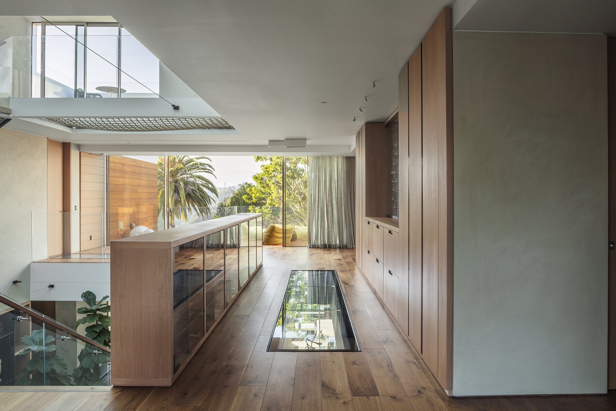
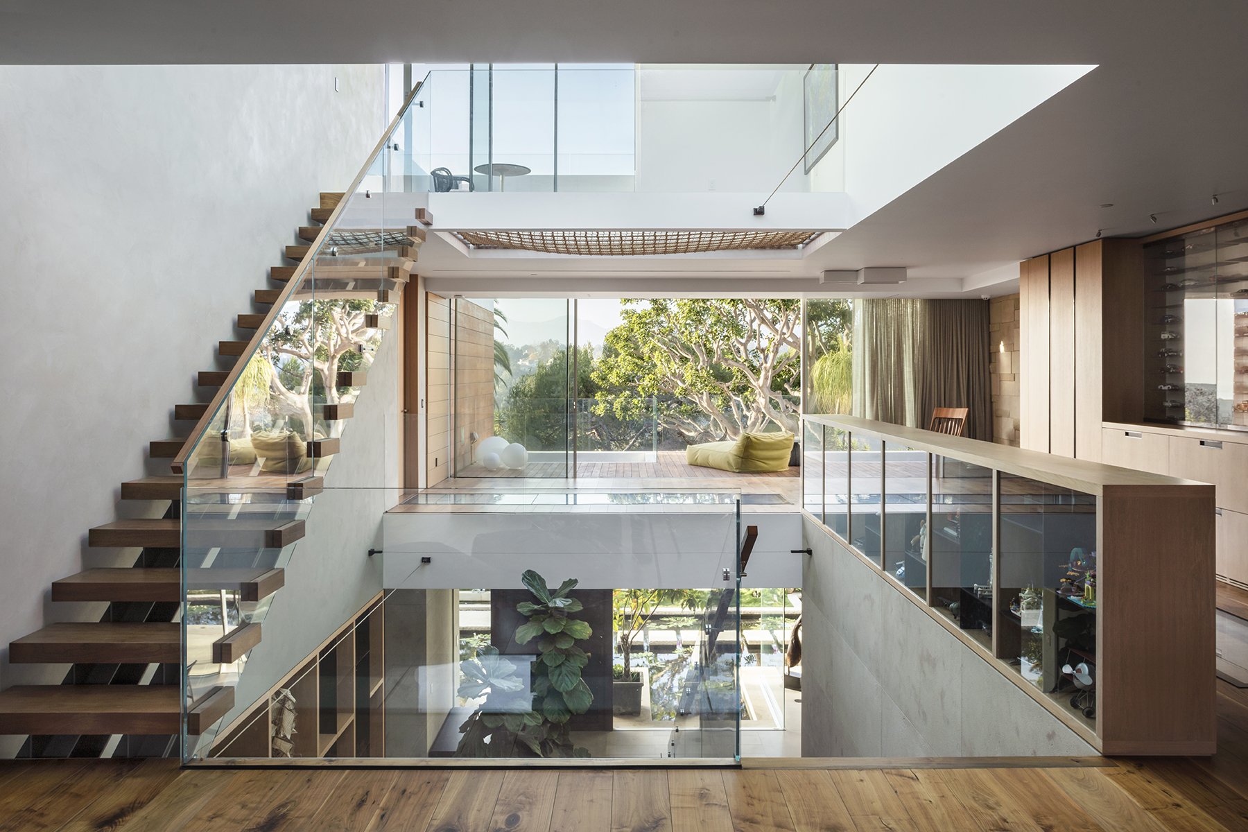
Marc has designed three levels, with a central volume and floating stairs topped by a large skylight. This plan helps to maintain a visual connection, as you can look down from the upper level to the main floor, and can see where others are in the house.
Glass walkways and floor windows are incorporated to aid in this and to bring natural light throughout.
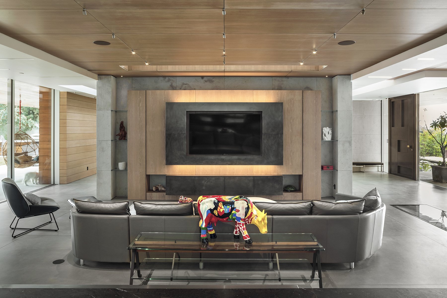
Horizontally, the open floor plan allows a view into all areas at the same time. The use of uniform materials like the teak, the stone, or the extra-sized porcelain tiles that were used on the floors allows for flow from one area to another, giving a peaceful unified feeling in the main living space.
LTA+ D designed a teak and steel shelving unit to display the client’s ship and artwork collection, as well as to serve as a room divider.
In the kitchen, Livia used teak for the cabinets and a Breccia Imperiale marble for the island. A stainless-steel plane is attached like a blade in one end of the island, creating a seating area.
At the other end, Livia incorporated into the design a specialty stool for the client, so he can sit at his favorite spot at just the right height. The leather seat was also salvaged from the original house.
Opposite the open kitchen a large screen is placed inside a wall unit, so that it appears to be excavated into the stone.
The seating area is adjacent to the dining room, which is surrounded by glass, with a view of the entry ponds.
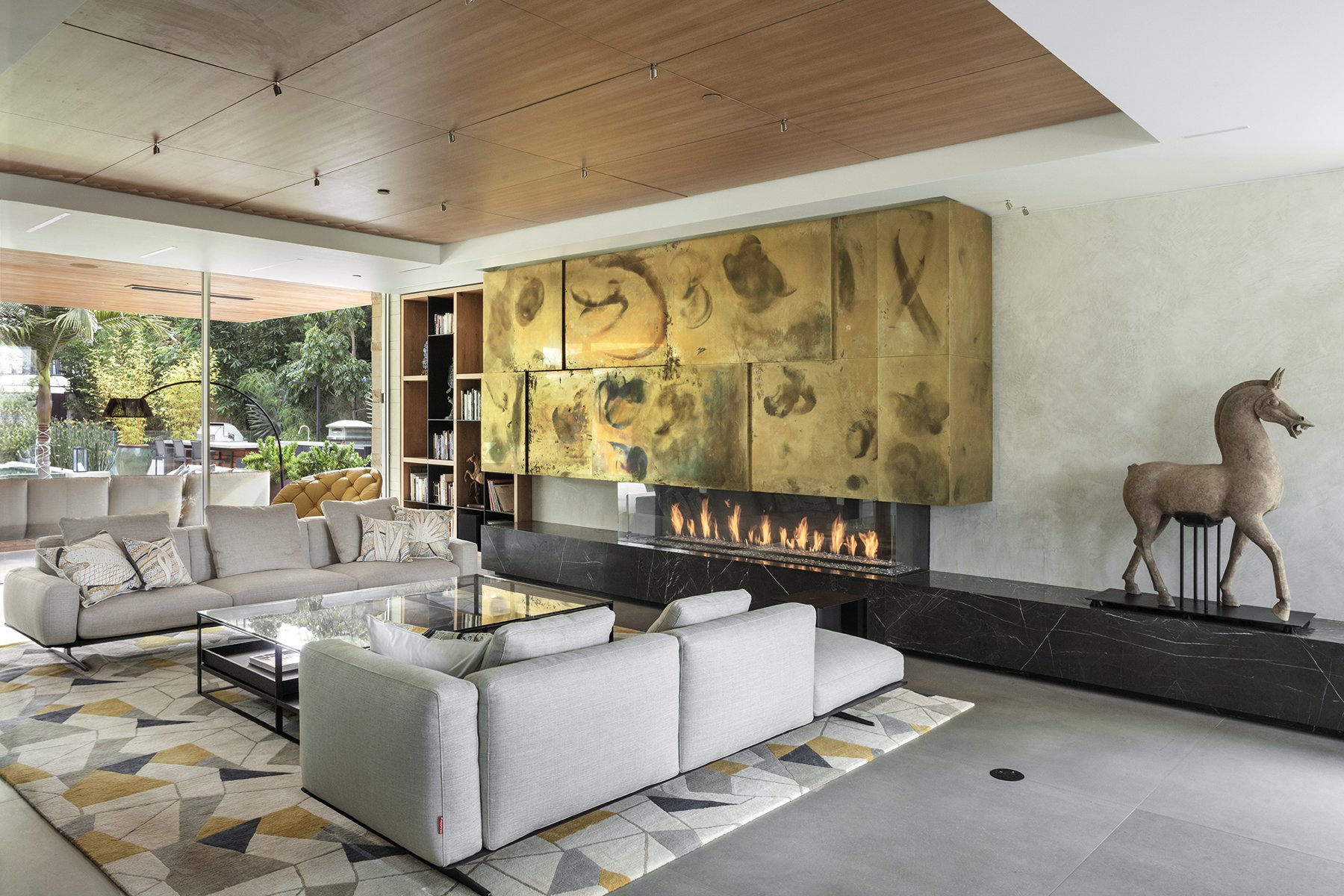
In the living room, Livia designed the brass cabinet above the fireplace with the double intent of hiding the fireplace engine, and to have it open to reveal a bar and a turntable for the client’s extensive LP collection.
More built-in display cases are above the stairway and along the upstairs open hallway.
There, the matchbox car collection can be easily changed out or reorganized.
Powder Room
On one wall of the powder room a leafy plant and a bird live in a striking glass mosaic of blues and whites. This piece was salvaged from the old house by removing the entire wall with its plaster backing intact. A simple freestanding washbasin fashioned in “VetroFreddo” (by Glass Design) allows one to admire the entire mosaic.
Lighting
The lighting was designed by LTA+D, together with Fabertechnica, creating a uniform feeling throughout, while supporting the architectural lines and enhancing the specialty designed furniture, and the beauty and simplicity of the materials. The lighting design called for different low voltage systems, some dedicated to the illumination of spaces and architectural surfaces, others to the functions and collections they host: recessed strip lines, micro spots used in alcoves, ceiling, and decorative fixtures, and some custom designed fixtures made using salvaged pieces, or for special locations like the BBQ area.
The garden was interpreted as a luminous scenography, clearly visible through the generous windows, just as the interiors were designed as a lantern in relation to the multiple views that the garden offers. The visual interplay between the inside and the outside was one of the founding elements of the lighting project.
Primary Suite and Bath
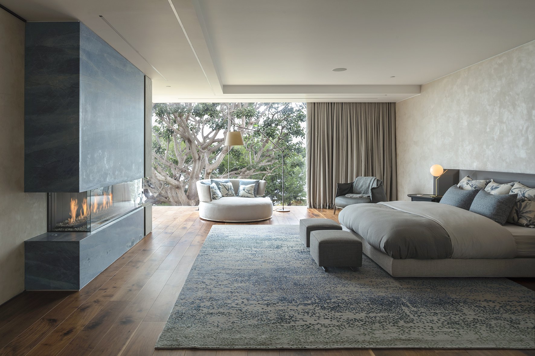
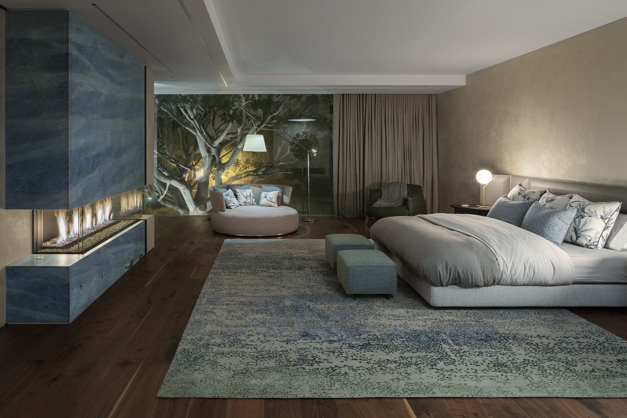
”The framing of the mature coral tree outside the primary bedroom brings the outside inside,” Livia explains.
“The green of the tree and the blue ocean inspired the colors for the room– first the fireplace marble and then the other colors.” The fireplace is of Azul Macaubas (a Brazilian marble), combined with the “Grigio Perla” stone that is used all over the house. In here, Livia also incorporated classic bronzed brass tiles salvaged from the original fireplace.
The custom made rug by Tai Ping and the decorative linen pillows blend together all the colors.
Just off the primary suite is a small terrace overlooking the coral tree and canyon.
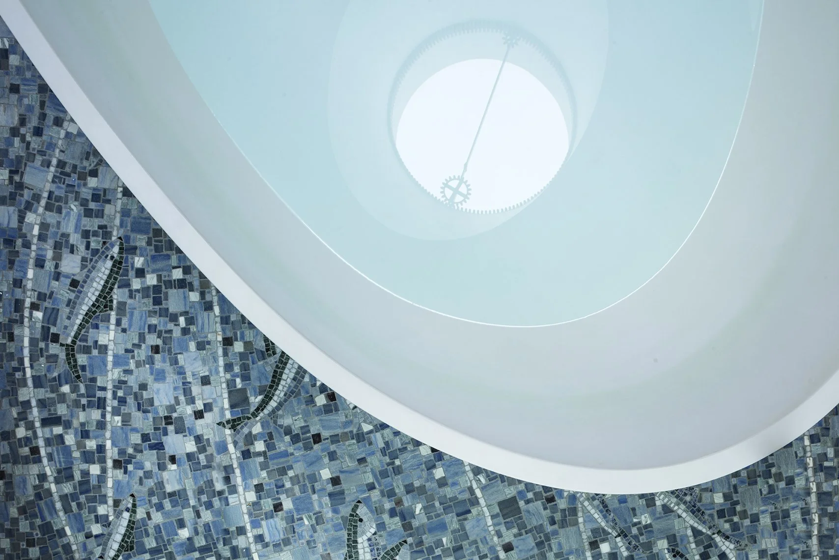
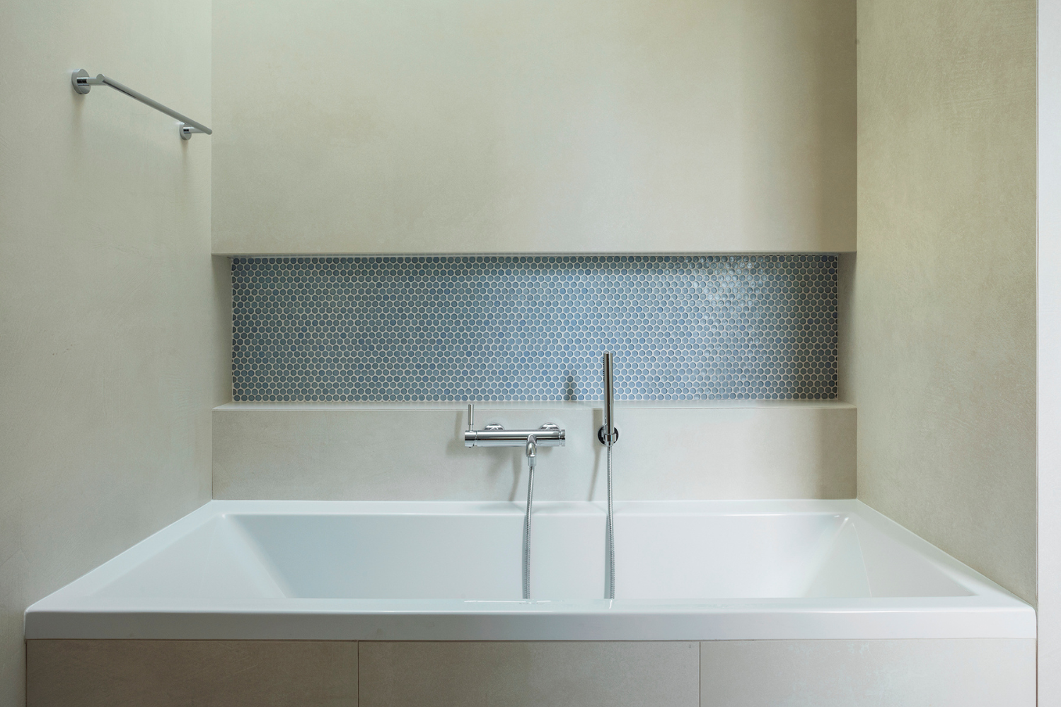
In the suite’s bath, a sea-colored swath of hand cut marble mosaic flows under the ovoid tub.
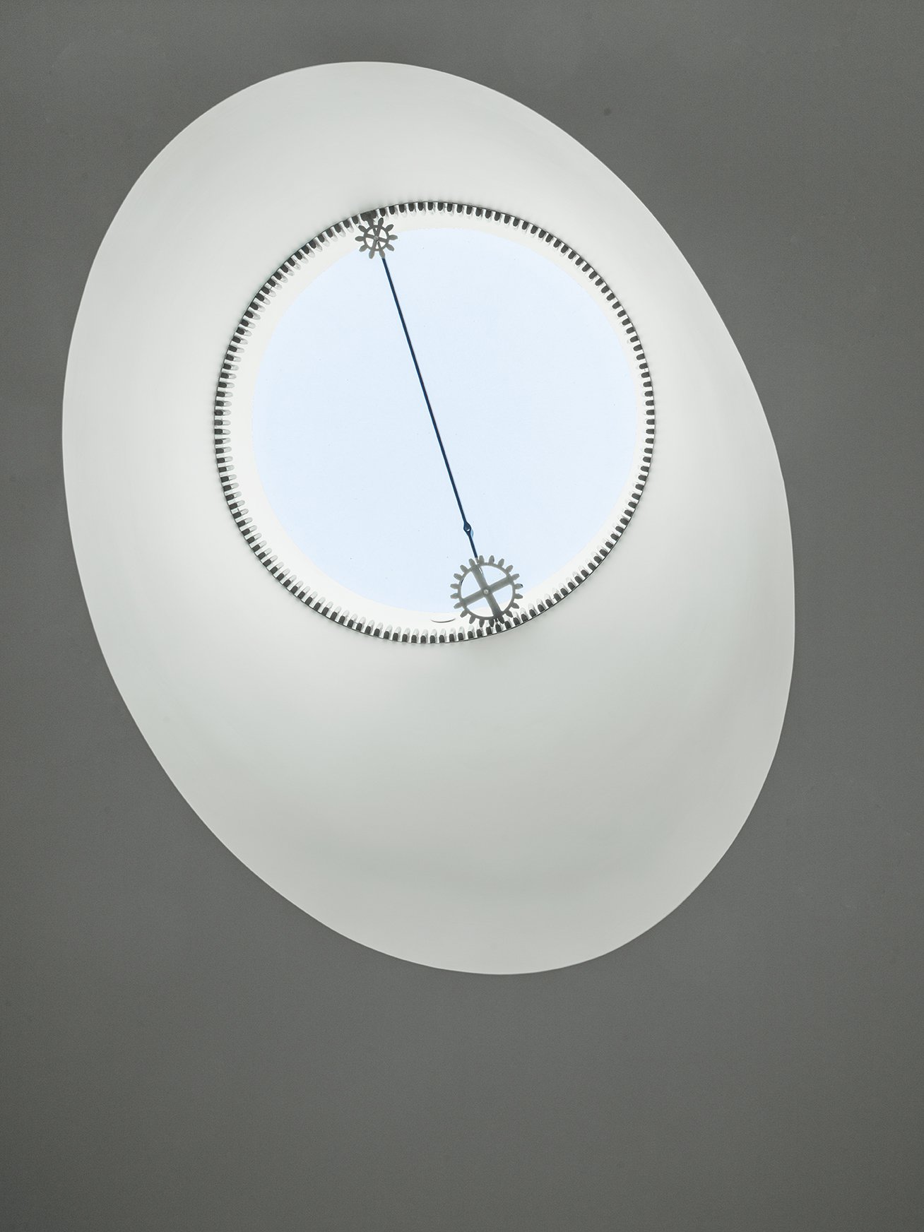
Above the tub, Livia designed a matching skylight aperture, incorporating a compass dial detail taken from the skylight in the entry hall of the original house.
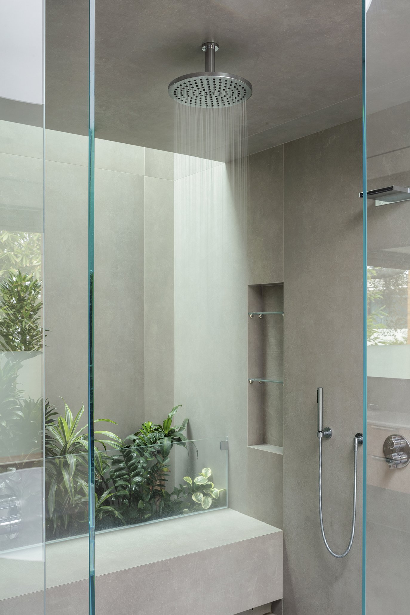
Inside the shower is a planter for greenery, which gets natural light from a skylight above.
Two Children’s Bedrooms, Two Guest Bedrooms, and Baths
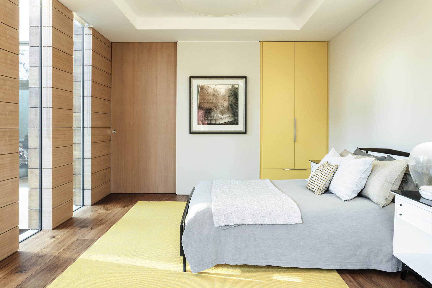
For the upstairs children and guest bedrooms and baths, Livia used the same base materials and light fixtures, but chose a different accent color combination for each room: gray and blues for the boy, purples and white for the girl, and yellow and beige for the guest room. Unusual elements add fun to the children’s rooms; a race car shaped reading nook and a jukebox in the boy’s room, and a hanging teepee chair where the stuffed animals are enjoying a nap in the girl’s bedroom.
In the guest room, the exterior teak pattern continues inside, toning down the bright yellow of the wardrobe and rug.
For this room, an old bedroom set that had sentimental value for the client was restored.
The downstairs guest bedroom looks out to the patio and pool, bringing inside the blues and the greens of the pool and vegetation, together with the off white of the stones, all accented with the addition of walnut wood flooring.
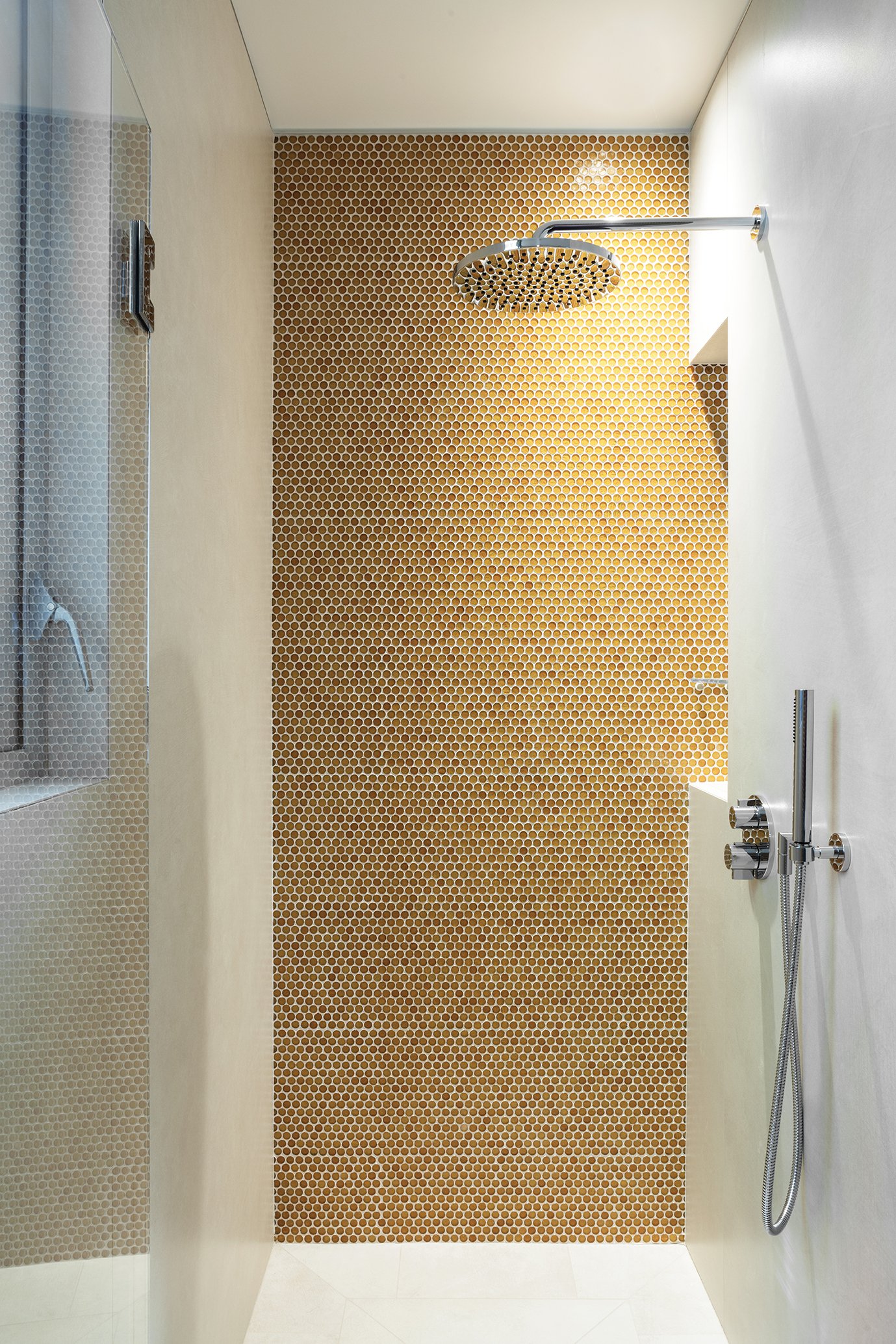
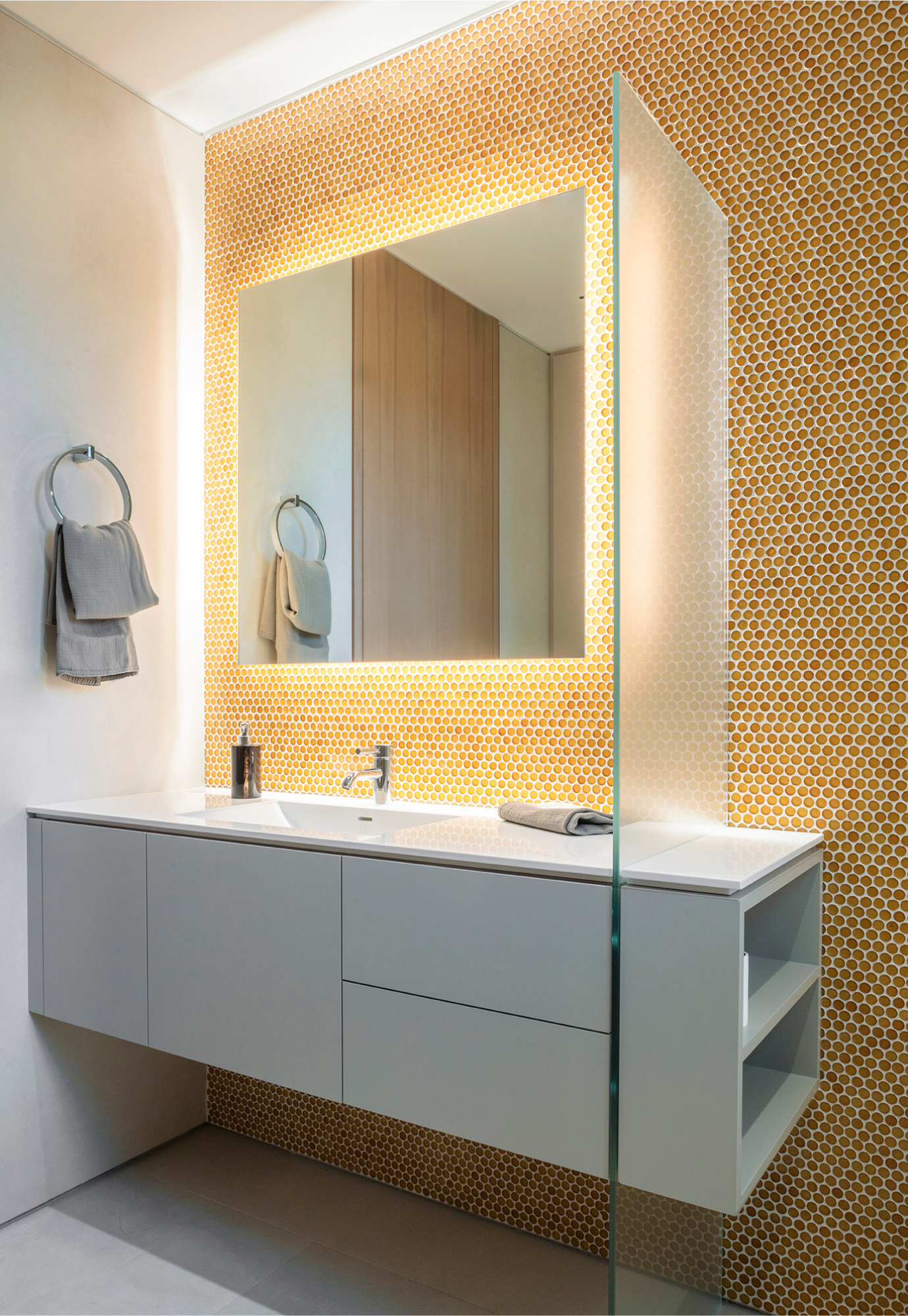
Custom glass mosaic by Sicis is used in all the baths, together with extra-large porcelain tiles by Florim. Bath fixtures throughout are from Dornbracht; all the vanities in the baths were custom by Agape.
Children’s Library
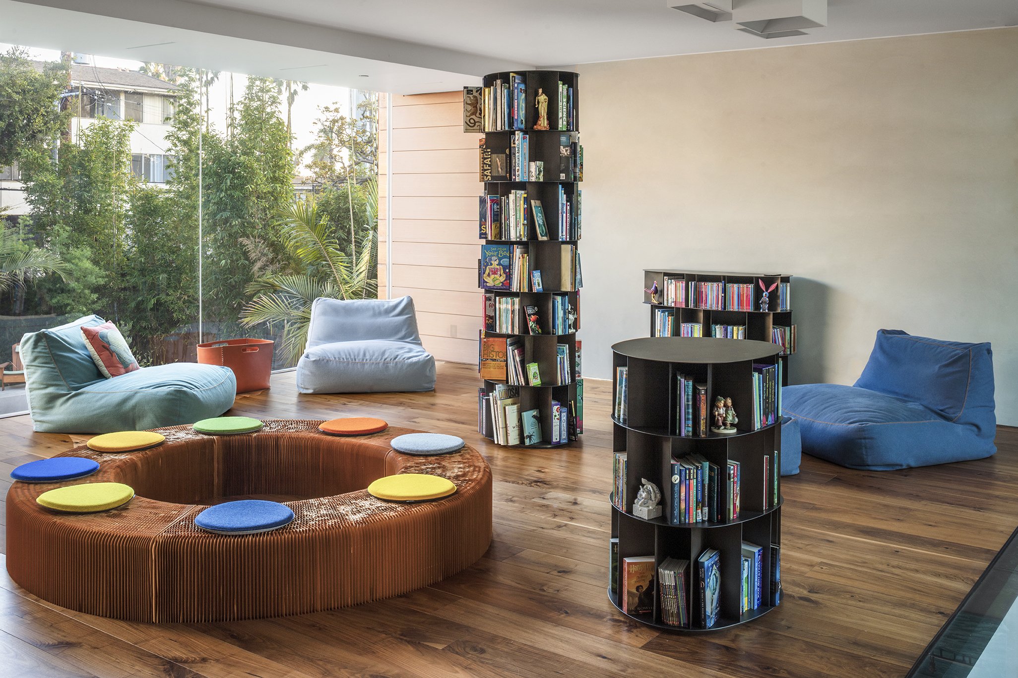
Livia’s concept for the room was to create an interior forest of bookcase towers. Everything is made of steel and teak. She wanted it to be colorful and fun, and evenly lit.
Also in this room, she used one of the pieces that had sentimental value for the client – the chest against the wall. For this piece, the designer had an artist paint a colorful, lively decoration all around.
One flight up from the library is a playfully daring element - a reading hammock suspended over the central volume.
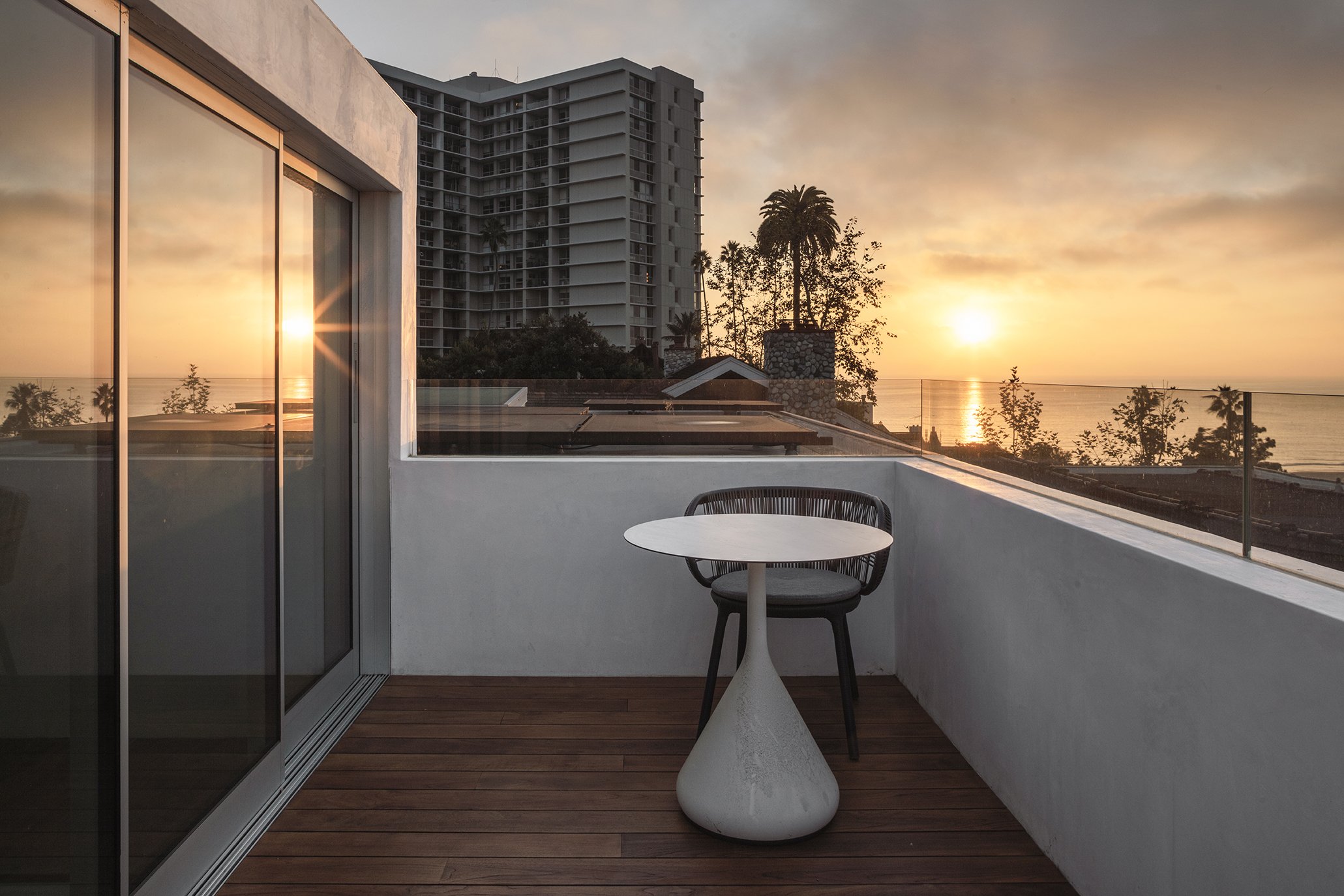
A door on that level opens onto a small rooftop deck with a wonderful view of the ocean and California sunset skies.
The Lower Level
The exercise studio is open to a small, sunken patio with a stairway that brings in natural light.
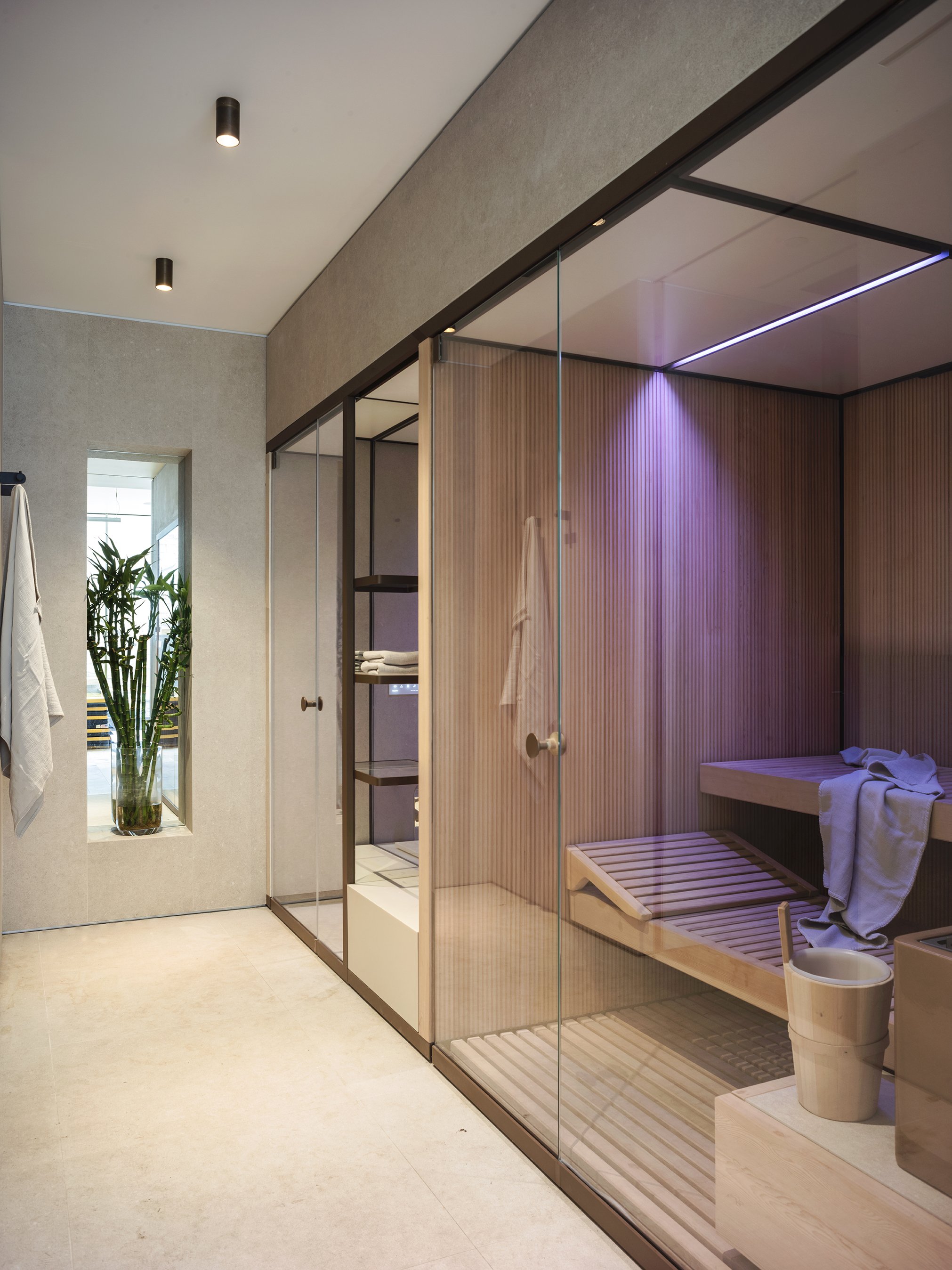
Nearby is a sauna and hammam by the Italian company Effegibi. They provide modular, self-contained saunas and steam rooms; the units are pre-made and can be installed, plugged in, and then the finish work completed using the desired finishes.
Also at the lower level is the music and recreation room, with all the client’s album collection covers on display.
Right next door, the garage includes a car collection with a turntable for easy access.
Pool and Patio
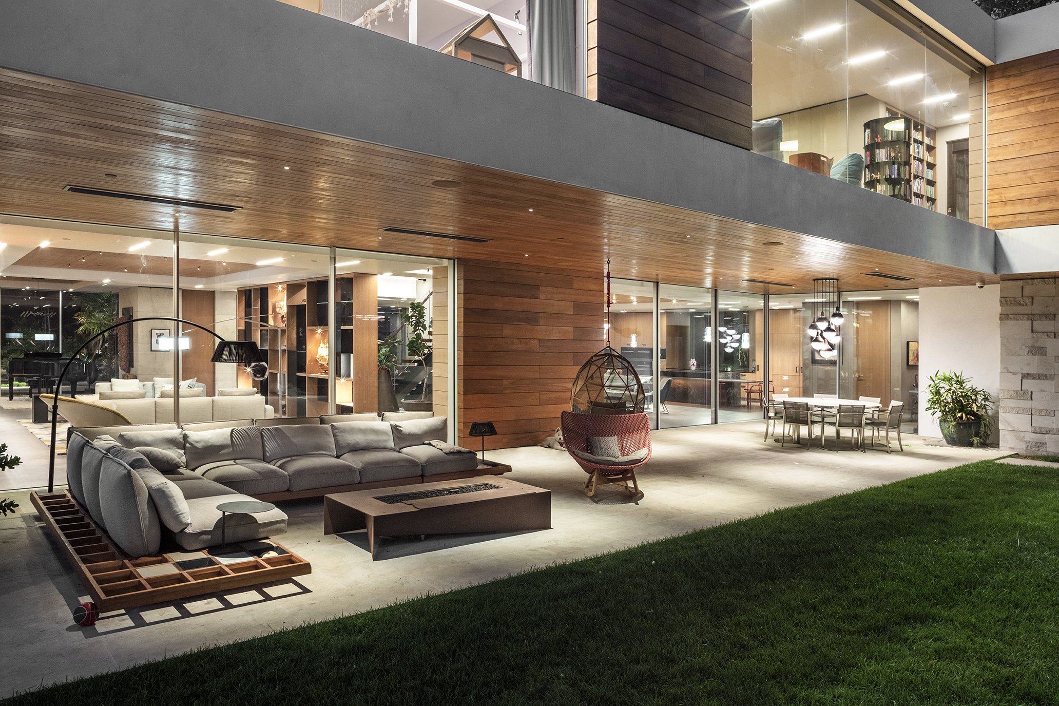
The window walls that open to the outside allow for a complete indoor-outdoor feeling. Livia wanted very simple furnishings outside, and the custom teak and stone used elsewhere are repeated.
The deep overhang provides shade and intimacy to the patio seating and dining areas.
Further out by the pool and spa is an outdoor kitchen island that includes a BBQ and a pizza oven.
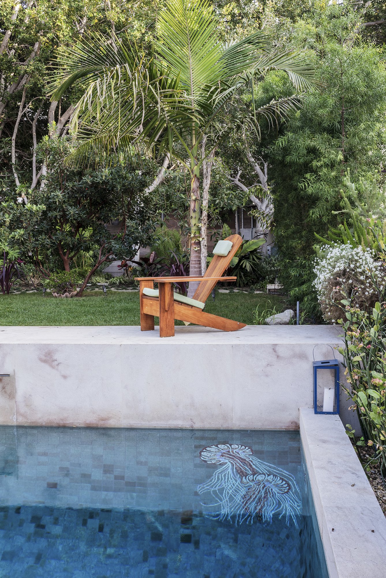
Adding to the creativity and amusement in the pool is a pair of mosaic jellyfish swimming in a corner.
And, in keeping with the client’s sense of fun and adventure, the kids have a Volkswagen camper van for a playhouse.


